Great photographs – without them, our kitchen design world would be a drab and dull place indeed.
Think how closely aligned our business is to the fashion industry. We use the same jargon: we’re kitchen designers, they’re fashion designers. Our work is called style, we probably “borrowed” it from fashion. Entire websites, magazines and tv shows are devoted to both our work and to their work. We create and follow trends, as does the fashion world. And we both sell the same things: beauty, glamour, luxury, romance, sex.
And all of us would be lost without great photographs. Yet, unlike the world of fashion, many kitchen designers think a quick shot with their cell phone and they’re good. These designers do not appreciate or understand the power of great photography
Use Great Photographs to Promote Your Business
As a business owner, you have to showcase images that help you stand out from the crowd.
Great photography can mean the difference between “just ok” and “great”. Think how you come across to your prospects. If your photos look low quality, expect people to start out with you by asking “how much”? Low quality photos translate to low quality workmanship.
And vice versa. If your photos convey gracious living and luxury, you will attract customers who value quality and are willing to pay for it.
You want your photographs to capture images that will support and grow your brand and tell a visual story of who you are. People shopping for a new kitchen need to see photos to stir their imagination. Most people do not have the ability to visualize what their new space will look like. That’s why Houzz exploded when it appeared – it fulfills the need of homeowners who want to SEE what their remodels will look like.
What Makes a Great Photo?
What makes a kitchen photo good or not-so-good?
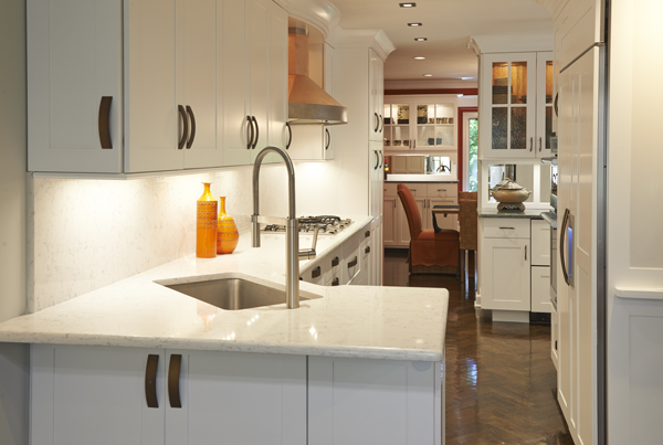
We’ll start with a good photo. What makes it good? This is a long, narrow, galley-style kitchen and yet from the angle chosen by the photographer, you can clearly see all elements of the room – sink, stove and fridge, shining countertop and backsplash, LED undercabinet lights, industrial-style faucet, even a section of the hood. You are invited into the scene to explore the rooms beyond. The simplicity of the design is further enhanced by the minimal styling. Everything is balanced and in proportion; no one element overpowers the shot.
Your prospects don’t need to analyze a great photo like we just did. It speaks to them, and they don’t know why. It just does. That’s a great photo.
No-no’s for Great Photographs
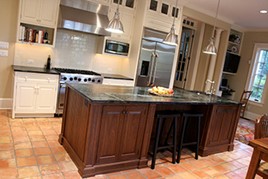
Now let’s look at a few “bad” photos. We probably don’t even have to say why this one is bad. This is a beautiful kitchen! Look at all the features that make it desirable. And yet, we look at this and think: I don’t want a kitchen designer whose work is shown like this. Do they even know what level and square is?
How could this be fixed? A tripod will hold your camera steady and help to square up the shot.
Here’s another really nice kitchen shown in a bad way. What color is this room? Is it white? Is it gray? How can we tell when the lighting is so poor?
How to fix this? Either Photoshop or other digital photo-editing software can add some brightness and/or contrast. Or you can get some lights at a photo supply store that provide indirect lighting that won’t create “hot spots” and will bounce light off the ceiling.
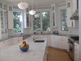
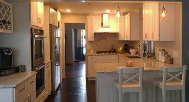
One more example of “bad” that could have been “good.” Poor lighting and fuzzy focus do not show this nice kitchen to any advantage.
Again, Photoshop or other digital photo-editing software could revive this photo that is now D.O.A.
Styling the Shot to Create Great Photos
In our design world, factors other than lighting and leveling must be considered when photographing finished jobs. Staging the shot shows how a kitchen will look when it’s lived in. And your prospects imagine themselves stepping into a room just like this.
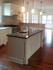
Here’s a lovely kitchen, completely bare. The shining hardwood floors, the custom wood hood, furniture feet on the sink base, turned post accents – all fabulous custom kitchen features. But wouldn’t bar stools, flowers, a bottle of wne make it look more appealing and inviting?
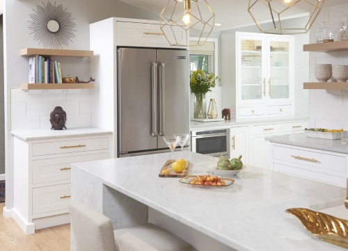
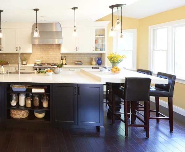
The photo (below) is the ideal to which all photo staging should aspire. Not only is this kitchen fabulous in all its white glory, the photo is staged perfectly. The accessories complement the kitchen in a way that looks “real.” They fill in empty spaces, but don’t overpower the overall room design. Photo staging doesn’t get any better than this. Couldn’t you imagine living your best life with this room at its center?
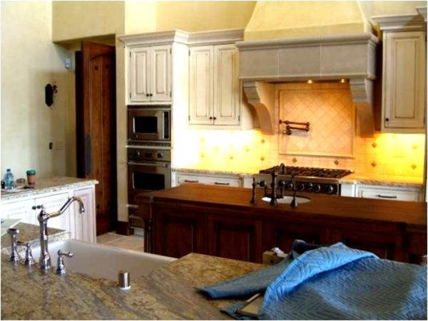
And then there’s this (left).
Whoever took this photograph was looking over the cabinet wrap blankets at the lovely cabinets beyond. This is where a professional photographer would save the shot.
You would not get a photo like this if a professional was involved.
Truly this photo is unusable because of the poor staging and layout.
And that’s a shame because there are features that are worth showcasing.
Make Pros Your New Best Friends to Get Great Photos
When your marketing photos are professional, they will attract customers, create value in the eyes of your prospects, and build your brand. Think of all the different ways you can use photos: Pinterest, Houzz, your website, Facebook, LinkedIn, Instagram, news releases, articles for local publications, design contest entries, email marketing, and more.
The photo at right is a dark, fuzzy and out of focus cell phone shot of a very nice kitchen.
The quality of photos from cell phones has come a long way, but they are still inferior to a professional shoot.
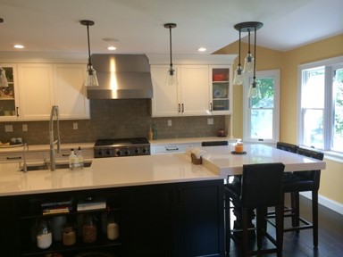
Below is the same room, shot by a professional. What a difference! Details are crisp, and lighting creates an appealing glow on the hardwood floor.
Yes, professional photography can be pricey, but it is so so so worth it.
“The trained eye of a professional photographer can capture your work in the best possible way.”
Benefits of Working with Professional Photographers
In addition to superior equipment, the professional has a trained “eye.” He or she knows how to frame the shot to best capture the vibe of the space. The pro knows how to light the scene, something amateurs struggle with. And the professional knows just where to place the fruit and the wine to fill any blank spaces. What he sees in the camera is completely different from what you see looking at the same thing.
In today’s digital world, you get to see what your photo will look like on the computer screen before the camera shutter clicks. Don’t like the way the light reflects off the backsplash? Move the camera up or down, adjust the lighting. Don’t like the cupcakes in the shot? Take them out. Gone are the days of getting “surprised” when photos don’t turn out.
When you form a working relationship with a professional photographer, he or she can get to know what you want in your photos to best showcase your work. You get to know how they work and what they charge. It’s a win-win for both of you.
Conclusion
Photographs create instant reactions. In the first few seconds, photography shows off your work. It compels people to take a closer look. Our industry is based on good visuals. We all need great photographs to help us market our products and sell our services.
As the old saying goes: sell the sizzle, not the steak. And your photos provide that sizzle.
Photos of your completed kitchen remodel jobs are captured images that will support and grow your brand and tell a story of who you are and what you can do.
At Bob Aungst Cabinet Sales, we work with kitchen dealers and designers and design-build remodelers throughout Pennsylvania, New Jersey, Delaware and Maryland to help them plan cabinetry for real homes and real lifestyles.
